Code in the Dark Montreal 2019
November 19, 2019

What exactly is "Code in the Dark"?
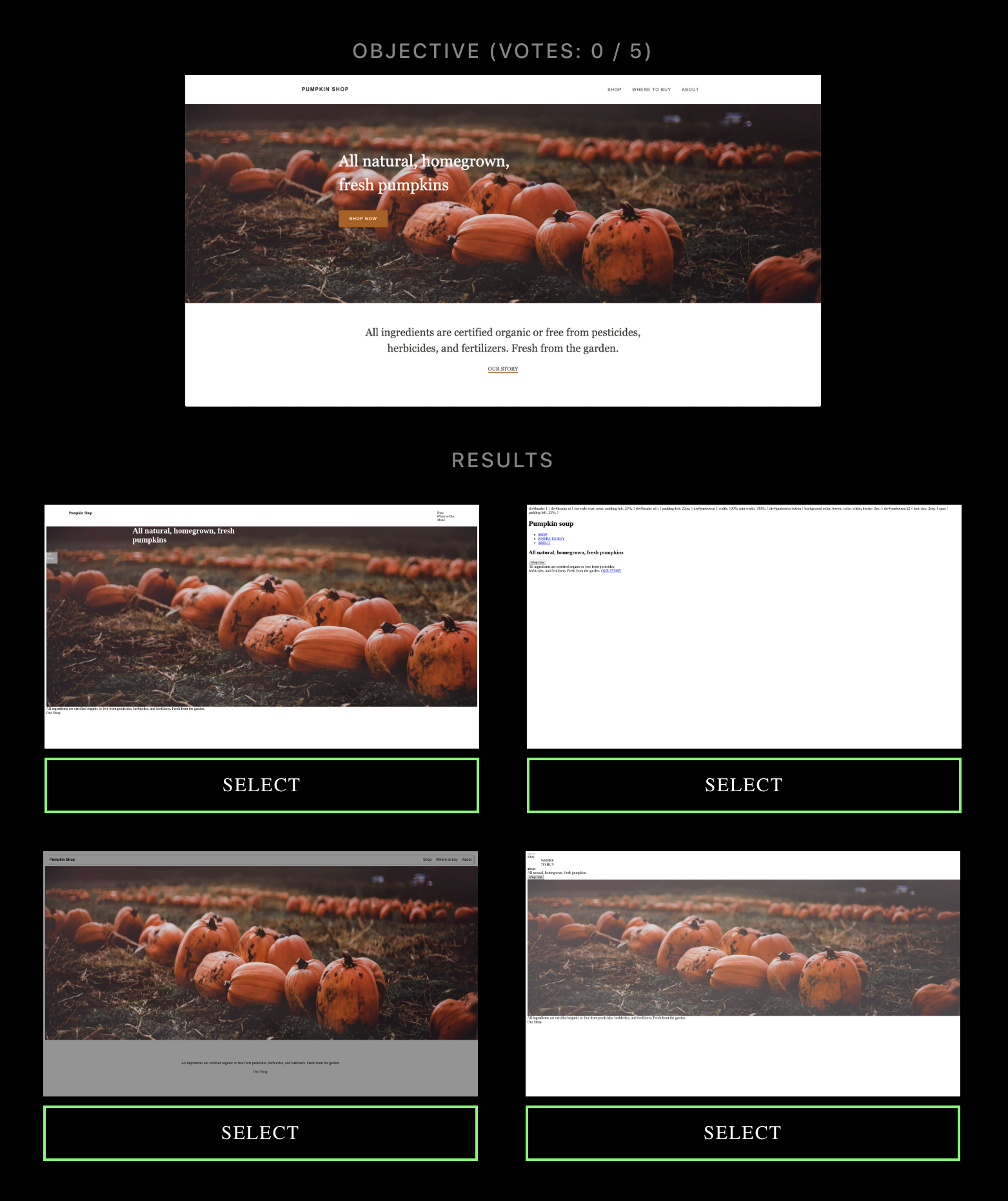
Code in the Dark is an unusual front-end coding competition. According to the rules from the Code in the Dark repository, competitors get 15 minutes to code a webpage based on a screenshot. Doesn't sound too strange, but there's a twist: competitors can't leave the (rather annoying and inaccessible) official competition editor while competing. That means no key-bindings, no linting, no libraries, no previews, no inspecting assets, and, perhaps scariest of all, no web searching.
The concept reminds me of blind contour drawing, which is when an artist attempts to draw an image from a reference without looking at their drawing. The results can be pretty amusing and unexpected. The premise of this competition is not practical at all, but it's pretty funny to see how different your page turned out from what you had in mind.
What was Code in the Dark Montreal like?
Code in the Dark Montreal took place in a nightclub-like environment. In addition to free beverages (including alcoholic ones) and food (with vegetarian options) common to tech events, there were also DJs, strobe lights, disco balls, blacklight markers, light-up cups, and a center stage with a giant screen.
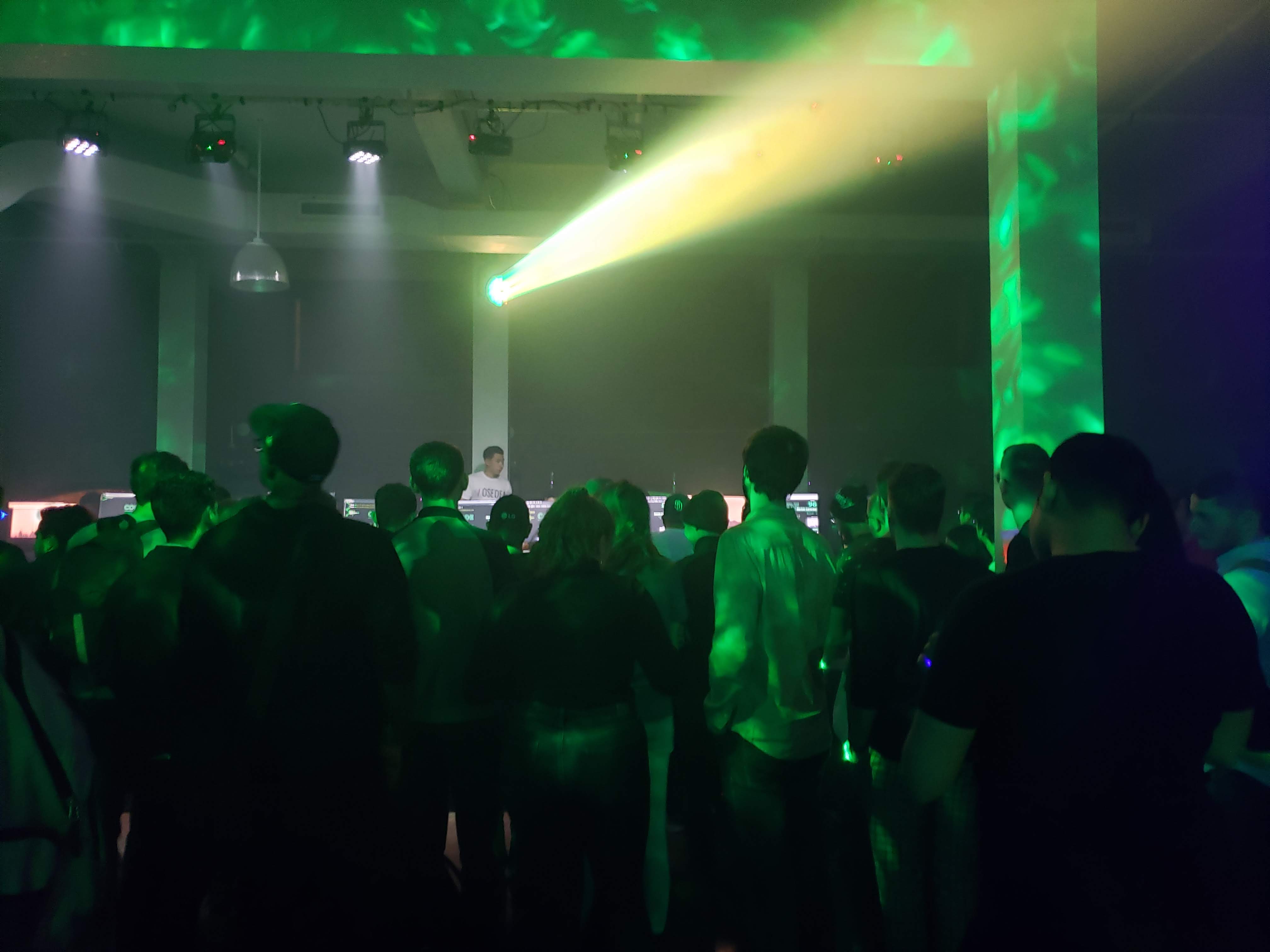
The competition itself has 3 rounds. Starting with around 200 competitors, and ending with a single grand prize winner of a $3000 cash prize.
What would I do differently next time?
This was my first time at any Code in the Dark event, and I unfortunately didn't make it past the first round. There's a few things I would have done differently based on this experience. Maybe I'll try again next year and get closer to that $3000 prize!
1. Sign up more than a day ahead of time
This couldn't really be helped since I didn't know about the event until I came across it it while browsing Eventbrite the day before, but I'd definitely try to sign up for the event as far ahead of time as possible.
The organizers sent out information to competitors, but they must've missed me because I signed up just a day before the event. This information would likely be especially helpful for first-timers like myself. I still don't know the full contents of the email, but it's where they told competitors to arrive an hour before the start time shown on Eventbrite. Since I'd only seen that start time, I assumed that would be when people were expected to start trickling in, and that the competition itself would start some time later. I only arrived a half hour before the event by chance. Luckily, it was still enough time to get all the instructions and start on time.
2. Get messier
We were told that our code needed to be valid HTML, but I doubt the code was ever actually being validated. I'm fairly certain the code just needs to render in whatever browser they're using to generate the screenshots, and that whatever's rendered will be passed along to the voting screen.
I was already coding "messy" by using all spans and divs in my markup. I would never do this on a real project because it would be terrible for accessibility. I only did it for this competition since it would save me from having to override default browser styles.
Even though I was already coding messier than usual, I think being even messier could've been advantageous. I had set up a basic valid HTML file and put all my styles in a style tag within the document's head. Since the competition editor doesn't have split-screen features, I had to scroll and up down between the head and body of the document to modify styles and markup. I think that using inline styles, at least for non-repeating elements, might've saved me some time and confusion.
3. Prioritize the prominent parts of the design
I hadn't thought about this before competing, but it's no surprise that nearly all the voters were using mobile devices.
The target design's screenshot was full-width at the top of the screen and submissions were listed below that at half-width. On a mobile device, the screenshots were probably not much larger than a postage stamp. It was technically possible to show a larger version of the screenshots, but I imagine most people were not inspecting the submissions that closely.
This means that small details like text content and font styles were imperceivable. However, it was obvious when large details like headlines and hero images strayed from the design. I should've spent less time making each navigation item have the correct text, and more time making sure I had the right src value for large images.
Conclusion
In the end, I had lots of fun even though I didn't make it as far as I'd hoped in the competition. If I'm in the Montreal area again next year, I'd love to give it another try!